Components
Components >
Accent box
Accent box
www.wbez.org 1
.c-accent-box
What's in the video?
The video shows Van Dyke shooting McDonald.
The nearly seven-minute video, recorded on a police dashcam, mostly shows officers on their way to McDonald, who was suspected of breaking into trucks and slashing the tire of a police car. The final minutes show Van Dyke exit a police SUV and open fire within seconds. McDonald falls to the ground, bullets keep hitting him, and an officer eventually kicks away the knife in his hand. McDonald lies on the pavement and receives no immediate aid. The video has no audio.
HTML Example
<div class="c-accent-box c-prose question">
<h2 class="question t-subhed -article">What's in the video?</h2>
<p class="question-short-answer">
The video shows Van Dyke shooting McDonald.
</p>
<p class="question-long-answer collapse show" id="long-answer-1" style="">
The
<a href="https://www.youtube.com/watch?v=Ix2N6_jLAgA"
>nearly seven-minute video</a
>, recorded on a police dashcam, mostly shows officers on their way to
McDonald, who was suspected of breaking into trucks and slashing the tire of
a police car. The
<a
href="http://www.chicagotribune.com/news/ct-chicago-cop-shooting-video-laquan-mcdonald-charges-20151124-story.html"
>final minutes</a
> show Van Dyke exit a police SUV and open fire within seconds.
McDonald falls to the ground, bullets keep hitting him, and an officer
eventually kicks away the knife in his hand. McDonald lies on the pavement
and receives no immediate aid. The video has no audio.
</p>
</div>
Components >
Button
Button
Buttons rely on color helpers for background and text color.
ferris-ds 18
www.wbez.org 10
.c-button
HTML Example
{% if className === '-circle' or className === '-circle-responsive' %}
<button class="c-button -circle -primary">
  <i class="c-icon c-button__inner t-size-m"
    ><svg aria-hidden="true"><use xlink:href="#play"></use></svg
  ></i>
</button>

{% elif className === '-outline' %}
<button
  class="c-button -circle -outline has-text-facebook has-bg-facebook has-text-hover-facebook l-align-center-children"
>
  <span class="c-button__inner c-icon">
    <svg aria-hidden="true"><use xlink:href="#facebook"></use></svg>
  </span>
</button>

{% else %}
<button class="c-button {{ className }}">Button</button>

{% endif %}
.-primary
Red background
ferris-ds 11
www.wbez.org 10
.-dark
Dark background
ferris-ds 3
www.wbez.org 3
.-round
For the most part, buttons associated with the player are rounded.
ferris-ds 7
www.wbez.org 4
.-circle
Action icons, etc.
ferris-ds 10
www.wbez.org 2
.-no-border
Sets border-color to transparent
ferris-ds 2
www.wbez.org 2
.-outline
Hover effect of outline
ferris-ds 2
Components >
Button overlay

Button overlay Legacy
Deprecated:
ferris-ds 4
.c-button-overlay
HTML Example
<div class="c-button-overlay" style="width: 145px;">
<a href="#" class="has-overlay-on-hover">
<img
src="https://api.wbez.org/v2/images/3b0bf719-1b89-4a8e-9f5f-3918c47e16b8.jpg?width=145&height=145&mode=FILL&threshold=0"
alt="Widespread Hospitalizations, One Death In Illinois Prompt Investigation Into Vaping"
/>
</a>
<div class="c-button-overlay__inner">
<button class="c-button -circle -primary t-size-s">
<i class="c-icon c-button__inner t-size-b"
><svg aria-hidden="true"><use xlink:href="#play"></use></svg
></i>
</button>
{#
<button class="c-button -circle t-size-s">
<i class="c-icon c-button__inner t-size-xxs" style="color: currentColor;"
><svg aria-hidden="true"><use xlink:href="#plus"></use></svg
></i>
</button>
#}
</div>
</div>
Components >
Calendar date
Calendar date
Todo: This should use the time element
ferris-ds 1
.c-calendar-date
Sep
18
HTML Example
<div class="c-calendar-date {{className}}">
  <div class="c-calendar-date__month">Sep</div>
  <div class="c-calendar-date__day">18</div>
</div>
.-dark
Sep
18
...
ferris-ds 1
Components >
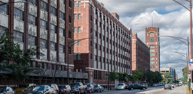
Caption

Terra cotta details hint at the businesses that formerly occupied these
spaces.
Jason Marck/WBEZ
Caption
This is a block of text, which gives context to media.
ferris-ds 1
www.wbez.org 1
.c-caption
HTML Example
<figure>
  <img
    class="d-block l-width-full"
    src="https://picsum.photos/800/420?random"
    alt="Example image"
  />
  <figcaption class="c-caption">
    Terra cotta details hint at the businesses that formerly occupied these
    spaces.
    <span class="c-caption__credit">Jason Marck/WBEZ</span>
  </figcaption>
</figure>
Components >
Content unit
Content unit Legacy
Deprecated:
ferris-ds 7
.c-content-unit
HTML Example
{% if className === '-skinny' %}
{% set data = {
'headline': 'Widespread Hospitalizations, One Death In Illinois Prompt Investigation Into Vaping',
'imageUrl': 'https://api.wbez.org/v2/images/3b0bf719-1b89-4a8e-9f5f-3918c47e16b8.jpg?width=145&height=145&mode=FILL&threshold=0',
'datestamp': 'August 29, 2019', 'overline': 'Morning Shift'
} %}
{% include './partials/_skinny.html' %}
{% elif className === '-tile' %}
{% set data = {
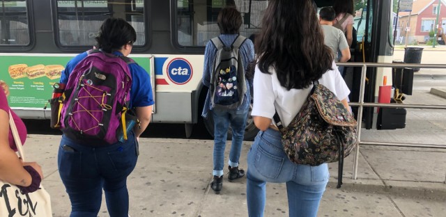
'headline': 'Teens Say Free CTA Rides On First Day Of School Are Not Enough',
'imageUrl': 'https://api.wbez.org/v2/images/0afc1386-105b-48ea-87ec-889d6593a0a1.jpg?width=640&height=312&mode=FILL&threshold=0',
'teaser': 'Chicago Public Schools students get free CTA rides on the first day of school. Students say they need the help year-round. ',
'overline': 'Education',
'datestamp': 'September 6, 2019'
} %}
{% include './partials/_tile.html' %}
{% elif className === '-row' %}
{% set data = {
'overline': 'Morning Shift',
'headline': 'What’s That Building? This Chicago Industrial Park Was The Nation’s First',
'teaser': 'Today, these South Side buildings are mostly empty — but in the early 1900s they produced everything from tires to coffee.',
'datestamp': 'September 6, 2019'
} %}
{% include './partials/_row.html' %}
{% elif className === '-row-featured' %}
{% set data = {
'imageUrl': 'https://api.wbez.org/v2/images/60a26a31-a0ea-4025-817e-d243977fc7bb.jpg?width=120&height=120&mode=FILL&threshold=0',
'overline': 'Morning Shift',
'headline': 'What’s That Building? This Chicago Industrial Park Was The Nation’s First',
'teaser': 'Today, these South Side buildings are mostly empty — but in the early 1900s they produced everything from tires to coffee.',
'datestamp': 'September 6, 2019'
} %}
{% include './partials/_row-featured.html' %}
{% elif className === '-event' %}
{% include './partials/_event.html' %}
{% else %}
{% set data = {
'imageUrl': 'https://api.wbez.org/v2/images/60a26a31-a0ea-4025-817e-d243977fc7bb.jpg?width=640&height=312&mode=FILL&threshold=0',
'overline': 'Morning Shift', 'headline': 'What’s That Building? This Chicago Industrial Park Was The Nation’s First',
'teaser': 'Today, these South Side buildings are mostly empty — but in the early 1900s they produced everything from tires to coffee.',
'datestamp': 'September 6, 2019'
} %}
{% include './partials/_default.html' %}
{% endif %}
.-skinny
.-tile
.-row
.-row-featured

.-event

Components >
Flyout
www.wbez.org 1
.c-flyout
HTML Example
<div class="c-flyout">
  <button
    aria-haspopup="true"
    aria-expanded="false"
    class="c-flyout__toggle c-button -round -primary t-size-s"
  >
    Subscribe
    <i class="c-icon t-size-s ml-xxxs">
      <svg aria-hidden="true">
        <use xlink:href="#rss"></use>
      </svg>
    </i>
  </button>
  <ul class="subscribe-links c-flyout__items has-bg-white p-tiny">
    <li>
      <a href="#" class="c-button t-size-xs">
        Apple Podcasts
      </a>
    </li>
    <li>
      <a href="#" class="c-button t-size-xs">
        RSS Link
      </a>
    </li>
  </ul>
</div>

<script>
  const flyoutItems = document.querySelectorAll('.c-flyout');

  Array.prototype.forEach.call(flyoutItems, function(el) {
    const btn = el.querySelector('.c-flyout__toggle');

    // toggle menu display on btn click
    btn.addEventListener('click', function(event) {
      const expanded = btn.getAttribute('aria-expanded');

      if (expanded === 'true') btn.setAttribute('aria-expanded', 'false');
      else btn.setAttribute('aria-expanded', 'true');
    });

    // hide submenu if focus leaves flyout menu
    el.addEventListener('focusout', e => {
      if (!el.contains(e.relatedTarget))
        btn.setAttribute('aria-expanded', 'false');
    });
  });
</script>
Components >
Hero
Hero
A hero banner. Combine with l-full.
Elements:
c-hero__backdropc-hero__bodyc-hero__copy
www.wbez.org 10
.c-hero
Criminal Justice
HTML Example
<div class="c-hero {{ className }}">
  <div class="l-container">
    <h1 class="c-hero__copy t-headline t-align-center">
      Criminal Justice
    </h1>
  </div>
</div>
.-blurred
Blur the backdrop
www.wbez.org 1
.-fullheight
Criminal Justice
At least as tall as the page
.-fullheight-minus-nav
Criminal Justice
At least as tall as the page minus $navbar-height
www.wbez.org 4
Components >
Icon
Icon
SVG icon class. Icons will take the size of parent font-size. Default fill is yellow with a helper for white, teal, and gray icons.
ferris-ds 17
www.wbez.org 4
.c-icon
Words next to the icon!
HTML Example
<span class="c-icon {{ className }}">
  <svg aria-hidden="true"><use xlink:href="#search"></use></svg>
</span>
Words next to the icon!
.-baseline
Words next to the icon!
Forces a the vertical alignment to the baseline of the font.
Components >
List
List
Our standard list is just plain ol' bullets. Children can be either <li> elements or have the class .c-list__item.
ferris-ds 2
www.wbez.org 5
.c-list
- Bacon
- Eggs
- Cheese
- Potato
HTML Example
<ul class="c-list {{className}}">
  <li>Bacon</li>
  <li>Eggs</li>
  <li>Cheese</li>
  <li>Potato</li>
</ul>
.-compact
- Bacon
- Eggs
- Cheese
- Potato
.-inline
- Bacon
- Eggs
- Cheese
- Potato
To display the list inline
ferris-ds 2
.-inline-bullet
- Bacon
- Eggs
- Cheese
- Potato
To display the list inline, with bullet separators
www.wbez.org 4
Components >
Mini form
Mini form
A text input adjacent to a button/submit input.
ferris-ds 1
.c-mini-form
HTML Example
<form class="c-mini-form">
  <div class="c-mini-form__input">
    <div class="c-text-input">
      <input
        placeholder="Your email address"
        id="email"
        name="email"
        aria-label="email address to link"
        type="text"
        class="c-text-input__input is-invalid d-block l-width-full has-text-gray-dark mb-xxxs"
      />
      <label class="c-text-input__label" for="email">Your email address</label>
      <ul>
        <li class="has-text-error mb-xxxs t-size-xs">
          First validation error
        </li>
        <li class="has-text-error t-size-xs">Second validation error</li>
      </ul>
    </div>
  </div>
  <div class="c-mini-form__submit">
    <input
      type="submit"
      class="c-button -round t-size-s l-width-full d-block"
      value="Submit"
    />
  </div>
</form>
Components >
Pagination
www.wbez.org 1
.c-pagination
HTML Example
<nav aria-label="pagination" class="c-pagination">
  <a
    href="#"
    class="c-pagination__link c-button -no-border t-size-s"
    text="← First"
    aria-label="First page"
    title="First page"
    >← First</a
  ><a
    href="#"
    class="c-pagination__link c-button -no-border t-size-s"
    text="←"
    aria-label="Previous page"
    title="Previous page"
    >←</a
  ><a
    href="#"
    class="c-pagination__link c-button -no-border t-size-s"
    text="1"
    aria-label="Page 1"
    title="Page 1"
    >1</a
  ><a
    href="#"
    class="c-pagination__link c-button -no-border t-size-s"
    text="2"
    tabindex="-1"
    aria-current="page"
    aria-disabled="true"
    aria-label="Page 2"
    >2</a
  ><a
    href="#"
    class="c-pagination__link c-button -no-border t-size-s"
    text="3"
    aria-label="Page 3"
    title="Page 3"
    >3</a
  ><a
    href="#"
    class="c-pagination__link c-button -no-border t-size-s"
    text="4"
    aria-label="Page 4"
    title="Page 4"
    >4</a
  ><a
    href="#"
    class="c-pagination__link c-button -no-border t-size-s"
    text="→"
    aria-label="Next page"
    title="Next page"
    >→</a
  ><a
    href="#"
    class="c-pagination__link c-button -no-border t-size-s"
    text="Last →"
    aria-label="Last page"
    title="Last page"
    >Last →</a
  >
</nav>
Components >
Prose

The figcaption element example
Prose
Story bodies are a special component because we have limited control over the class names within them. We must deviate from BEM and create catch-all tag selectors to allow the greatest flexibility of the markup.
.c-prose
Our editor outputs blocks of texts with paragraph tags.
Helper classes needed
Note that we also sprinkle in sibling helper classes with story-body. For example, the t-linkstyle helper gives us the ability to style links like this.
Horizontal Rules
Use a horizontal rule to break up content. A horizontal rule is displayed below.
The hr tag has built in top and bottom margin. We do this because it's normally used as a spacing element and the need for cushion is assumed.
Headings
Heading 2
Heading 3 - Default
Heading 4
Heading 5
Heading 6
Plugins
Plugins are special and have their own rules for positioning. A div without the plugin class will still align with the story text, but any div prefixed with "c-plugin" will be excluded from the max-width and margin declaration the other elements adhere to.
Example of plugin. Should be not be bound by container.
Example of ad plugin. Should be not be bound by container
Blockquote
This is a standard paragraph. Lorem ipsum dolor sit amet, consectetuer adipiscing elit.
"This is a blockquote. Lorem ipsum dolor sit amet, consectetuer adipiscing elit. Nullam dignissim convallis est. Quisque aliquam. Donec faucibus. Nunc iaculis suscipit dui. Nam sit amet sem. Aliquam libero nisi, imperdiet at, tincidunt nec, gravida vehicula, nisl."
This is a standard paragraph. Lorem ipsum dolor sit amet, consectetuer adipiscing elit.
Unordered List (paragraphs)
-
The first rule sets a sitewide font and a baseline font size of 10px. These are inherited by everything on the page.
-
Rules 2 and 3 set relative font sizes for the headings, different list types (the children of the list elements inherit these), and paragraphs. This means that each paragraph and list will have the same font size and top and bottom spacing, helping to keep the vertical rhythm consistent.
-
Rule 4 sets the same line-height on the paragraphs and list items — so the paragraphs and each individual list item will have the same spacing between lines. This will also help to keep the vertical rhythm consistent.
Rules 5 and 6 apply to the description list — we set the same line-height on the description list terms and descriptions as we did with the paragraphs and list items. Again, consistency is good! We also make the description terms have bold font, so they visually stand out easier.
This is a standard paragraph. Lorem ipsum dolor sit amet, consectetuer adipiscing elit.
Figure-Caption
Details-Summary
The summary element example
The details example text. It may be styled differently based on what browser or operating system you are using.
Text Elements
The a element and external a element examples
The abbr element and an abbr element with title examples
The ACRONYM element example
The b element example
The cite element example
The code element example
The data element example
The del element example
The dfn element and dfn element with title examples
The em element example
The i element example
The ins element example
The kbd element example
The mark element example
The q element
example
The q element
example
inside
a q element
The s element example
The samp element example
The small element example
The span element example
The strong element example
The sub element example
The sup element example
The example
The u element example
The var element example
Monospace / Preformatted
Code block wrapped in "pre" and "code" tags
// Loop through Divs using Javascript.
var divs = document.querySelectorAll('div'), i;

for (i = 0; i < divs.length; ++i) {
  divs[i].style.color = "green";
}
Monospace Text wrapped in "pre" tags
Lorem ipsum dolor sit amet, consectetuer adipiscing elit. Nullam dignissim convallis est. Quisque aliquam. Donec faucibus. Nunc iaculis suscipit dui. Nam sit amet sem. Aliquam libero nisi, imperdiet at, tincidunt nec, gravida vehicula, nisl.
List Types
Ordered List
- List Item 1
- List Item 2
-
List Item 3
- List Item 3.1
-
List Item 3.2
- List Item 3.2.1
- List Item 3.2.2
- List Item 3.3
- List Item 4
Unordered List
- List Item 1
- List Item 2
-
List Item 3
- List Item 3.1
-
List Item 3.2
- List Item 3.2.1
- List Item 3.2.2
- List Item 3.3
- List Item 4
HTML Example
<section class="c-prose -story">
  <p>Our editor outputs blocks of texts with paragraph tags.</p>
  <h3>Helper classes needed</h3>
  <p>
    Note that we also sprinkle in sibling helper classes with story-body. For
    example, the t-linkstyle helper gives us the ability to style
    <a href="#">links like this.</a>
  </p>
  <h3>Horizontal Rules</h3>
  <p>
    Use a horizontal rule to break up content. A horizontal rule is displayed
    below.
  </p>
  <hr />
  <p>
    The hr tag has built in top and bottom margin. We do this because it's
    normally used as a spacing element and the need for cushion is assumed.
  </p>
  <h3>Headings</h3>
  <h2>Heading 2</h2>
  <h3>Heading 3 - Default</h3>
  <h4>Heading 4</h4>
  <h5>Heading 5</h5>
  <h6>Heading 6</h6>
  <h3>Plugins</h3>
  <p>
    Plugins are special and have their own rules for positioning. A div without
    the plugin class will still align with the story text, but any div prefixed
    with "c-plugin" will be excluded from the max-width and margin declaration
    the other elements adhere to.
  </p>
  <div class="c-plugin p-b has-bg-gray-light">
    Example of plugin. Should be not be bound by container.
  </div>
  <div class="c-plugin-ad p-b has-bg-gray-light">
    Example of ad plugin. Should be not be bound by container
  </div>
  <h2 id="blockquote">Blockquote</h2>
  <p>
    This is a standard paragraph. Lorem ipsum dolor sit amet, consectetuer
    adipiscing elit.
  </p>
  <blockquote>
    "<strong>This is a blockquote.</strong> Lorem ipsum dolor sit amet,
    consectetuer adipiscing elit. Nullam dignissim convallis est. Quisque
    aliquam. Donec faucibus. Nunc iaculis suscipit dui. Nam sit amet sem.
    Aliquam libero nisi, imperdiet at, tincidunt nec, gravida vehicula, nisl."
  </blockquote>
  <p>
    This is a standard paragraph. Lorem ipsum dolor sit amet, consectetuer
    adipiscing elit.
  </p>

  <h2 id="unordered-list-paragraphs">Unordered List (paragraphs)</h2>

  <ul>
    <li>
      <p>
        The first rule sets a sitewide font and a baseline font size of 10px.
        These are inherited by everything on the page.
      </p>
    </li>
    <li>
      <p>
        Rules 2 and 3 set relative font sizes for the headings, different list
        types (the children of the list elements inherit these), and paragraphs.
        This means that each paragraph and list will have the same font size and
        top and bottom spacing, helping to keep the vertical rhythm consistent.
      </p>
    </li>
    <li>
      <p>
        Rule 4 sets the same line-height on the paragraphs and list items — so
        the paragraphs and each individual list item will have the same spacing
        between lines. This will also help to keep the vertical rhythm
        consistent.
      </p>
      <p>
        Rules 5 and 6 apply to the description list — we set the same
        line-height on the description list terms and descriptions as we did
        with the paragraphs and list items. Again, consistency is good! We also
        make the description terms have bold font, so they visually stand out
        easier.
      </p>
    </li>
  </ul>
  <p>
    This is a standard paragraph. Lorem ipsum dolor sit amet, consectetuer
    adipiscing elit.
  </p>

  <h2 id="figure-caption">Figure-Caption</h2>

  <figure>
    <img src="https://placehold.it/350x150" alt="A placeholder figure image." />
    <figcaption>The figcaption element example</figcaption>
  </figure>

  <h2 id="details-summary">Details-Summary</h2>

  <details>
    <summary>The summary element example</summary>
    <p>
      The details example text. It may be styled differently based on what
      browser or operating system you are using.
    </p>
  </details>

  <hr />

  <h1 id="text-elements">Text Elements</h1>

  <p>
    The <a href="#">a element</a> and
    <a href="https://example.com" target="_blank">external a element</a>
    examples
  </p>
  <p>
    The <abbr>abbr element</abbr> and an
    <abbr title="Abbreviation">abbr</abbr> element with title examples
  </p>
  <p>
    The
    <acronym title="A Cowboy Ran One New York Marathon">ACRONYM</acronym>
    element example
  </p>
  <p>The <b>b element</b> example</p>
  <p>The <cite>cite element</cite> example</p>
  <p>The <code>code element</code> example</p>
  <p>The <data value="3967381398">data element</data> example</p>
  <p>The <del>del element</del> example</p>
  <p>
    The <dfn>dfn element</dfn> and
    <dfn title="Title text">dfn element with title</dfn> examples
  </p>
  <p>The <em>em element</em> example</p>
  <p>The <i>i element</i> example</p>
  <p>The <ins>ins element</ins> example</p>
  <p>The <kbd>kbd element</kbd> example</p>
  <p>The <mark>mark element</mark> example</p>
  <p>The <q>q element</q> example</p>
  <p>
    The <q>q element <q>inside</q> a q element</q> example
  </p>
  <p>The <s>s element</s> example</p>
  <p>The <samp>samp element</samp> example</p>
  <p>The <small>small element</small> example</p>
  <p>The <span>span element</span> example</p>
  <p>The <strong>strong element</strong> example</p>
  <p>The <sub>sub element</sub> example</p>
  <p>The <sup>sup element</sup> example</p>
  <p>The <time datetime="2005-05-15 19:00">time element</time> example</p>
  <p>The <u>u element</u> example</p>
  <p>The <var>var element</var> example</p>

  <hr />

  <h1 id="monospace">Monospace / Preformatted</h1>
  <p>Code block wrapped in "pre" and "code" tags</p>
  <pre><code>// Loop through Divs using Javascript.
var divs = document.querySelectorAll('div'), i;

for (i = 0; i < divs.length; ++i) {
  divs[i].style.color = "green";
}</code></pre>
  <p>Monospace Text wrapped in "pre" tags</p>
  <pre><p>Lorem ipsum dolor sit amet, consectetuer adipiscing elit. Nullam dignissim convallis est. Quisque aliquam. Donec faucibus. Nunc iaculis suscipit dui. Nam sit amet sem. Aliquam libero nisi, imperdiet at, tincidunt nec, gravida vehicula, nisl.</p></pre>

  <hr />

  <h1 id="list-types">List Types</h1>

  <h2 id="ordered-list">Ordered List</h2>
  <ol>
    <li>List Item 1</li>
    <li>List Item 2</li>
    <li>
      List Item 3
      <ol>
        <li>List Item 3.1</li>
        <li>
          List Item 3.2
          <ol>
            <li>List Item 3.2.1</li>
            <li>List Item 3.2.2</li>
          </ol>
        </li>
        <li>List Item 3.3</li>
      </ol>
    </li>
    <li>List Item 4</li>
  </ol>

  <h2 id="unordered-list">Unordered List</h2>
  <ul>
    <li>List Item 1</li>
    <li>List Item 2</li>
    <li>
      List Item 3
      <ul>
        <li>List Item 3.1</li>
        <li>
          List Item 3.2
          <ul>
            <li>List Item 3.2.1</li>
            <li>List Item 3.2.2</li>
          </ul>
        </li>
        <li>List Item 3.3</li>
      </ul>
    </li>
    <li>List Item 4</li>
  </ul>
</section>
Components >
Rubric
Rubric
aka the kicker
Elements:
c-rubric__item
ferris-ds 1
www.wbez.org 1
.c-rubric
HTML Example
<div class="c-rubric {{ className }} t-links -subtle">
<ul class="c-rubric__wrap t-ellipsis">
<li class="c-rubric__item -topic">
<a href="#">
Government & Politics
</a>
</li>
<li class="c-rubric__item -show">
<a href="#">
Reset
<i class="c-icon t-size-xxs">
<svg aria-hidden="true">
<use xlink:href="#rss"></use>
</svg>
</i>
</a>
</li>
</ul>
</div>
.-first-only
.-centered
Center it
.-has-rule
.-first-only.-has-rule
www.wbez.org 1
.-centered.-has-rule
Components >
Share bar
Share bar
Social share buttons.
www.wbez.org 2
.c-share-bar
HTML Example
<div class="c-share-bar {{ className }}">
<a
class="c-button -circle -outline has-text-gray has-bg-gray has-text-hover-gray"
target="_blank"
href="mailto:?to=&subject=What%E2%80%99s%20That%20Building%3F%20Chicago's%20Central%20Manufacturing%20District&body=I found this on WBEZ.org and wanted to share it with you. https%3A%2F%2Fwww.wbez.org%2Fshows%2Fmorning-shift%2Fwhats-that-building-chicagos-central-manufacturing-district%2F3bbcba2b-6c2f-4e43-8c1e-7f5ee4647f00%3Futm_source%3Demail%26utm_medium%3Dreferral%26utm_campaign%3DWeb-Share"
>
<i class="c-icon c-button__inner">
<svg aria-hidden="true"><use xlink:href="#envelope"></use></svg>
</i>
</a>
<a
class="c-button -circle -outline has-text-facebook has-bg-facebook has-text-hover-facebook"
data-link="https://www.wbez.org/shows/morning-shift/whats-that-building-chicagos-central-manufacturing-district/3bbcba2b-6c2f-4e43-8c1e-7f5ee4647f00?utm_source=facebook&utm_medium=referral&utm_campaign=Web-Share"
href="#"
>
<i class="c-icon c-button__inner">
<svg aria-hidden="true"><use xlink:href="#facebook"></use></svg>
</i>
</a>
<a
class="c-button -circle -outline has-text-twitter has-bg-twitter has-text-hover-twitter"
href="https://twitter.com/share?url=https%3A%2F%2Fwww.wbez.org%2Fshows%2Fmorning-shift%2Fwhats-that-building-chicagos-central-manufacturing-district%2F3bbcba2b-6c2f-4e43-8c1e-7f5ee4647f00%3Futm_source%3Dtwitter%26utm_medium%3Dreferral%26utm_campaign%3DWeb-Share&text=Today%2C%20these%20South%20Side%20buildings%20are%20mostly%20empty%20%E2%80%94%20but%20in%20the%20early%201900s%20they%20produced%20everything%20from%20tir..."
>
<i class="c-icon c-button__inner">
<svg aria-hidden="true"><use xlink:href="#twitter"></use></svg>
</i>
</a>
<a
class="c-button -circle -outline has-text-red has-bg-red has-text-hover-red"
data-toggle="modal"
data-target="#myModal"
href="#"
>
<i class="c-icon c-button__inner">
<svg aria-hidden="true"><use xlink:href="#link"></use></svg>
</i>
</a>
</div>
.-row
...
.-col
...
Components >
Splash background
Splash background
ferris-ds 2
.c-splash-background
HTML Example
<div class="c-splash-background" style="width: 100%; height: 200px;"></div>
Components >
Table
Table
.c-table
| Items | Expenditure |
|---|---|
| Donuts | 3,000 |
| Stationery | 18,000 |
| Totals | 21,000 |
HTML Example
<table class="c-table">
  <caption>
    He-Man and Skeletor facts
  </caption>
  <thead>
    <tr>
      <th>Items</th>
      <th scope="col">Expenditure</th>
    </tr>
  </thead>
  <tbody>
    <tr>
      <th scope="row">Donuts</th>
      <td>3,000</td>
    </tr>
    <tr>
      <th scope="row">Stationery</th>
      <td>18,000</td>
    </tr>
  </tbody>
  <tfoot>
    <tr>
      <th scope="row">Totals</th>
      <td>21,000</td>
    </tr>
  </tfoot>
</table>
Components >
Text input
Text input
Wrap input and label in a div with class .c-text-input for an animated label, similar to Google.
Override the small label color by setting the color for .c-text-input.
ferris-ds 5
.c-text-input
Invalid state example
- First validation error
- Second validation error
HTML Example
<div class="c-text-input" style="margin-top: 10px;">
  <input
    class="c-text-input__input"
    type="email"
    name="email"
    placeholder="Your email address"
    required
  />
  <label class="c-text-input__label" for="email">Your email address</label>
</div>

<div class="c-text-input" style="margin-top: 30px; color: blue; height: 50px;">
  <input
    class="c-text-input__input"
    type="email"
    name="email"
    placeholder="Your email address"
    required
  />
  <label class="c-text-input__label" for="email">Your email address</label>
</div>

<h3 class="mb-m mt-l">
  Invalid state example
</h3>
<div class="c-text-input">
  <input
    id="firstName"
    name="firstName"
    type="text"
    placeholder="First name"
    value="Cosmo Kramer"
    class="c-text-input__input is-invalid"
    aria-invalid="true"
  />
  <label for="firstName" class="c-text-input__label"> First name </label>
</div>
<ul>
  <li class="has-text-error mb-xxxs t-size-xs">
    First validation error
  </li>
  <li class="has-text-error t-size-xs">Second validation error</li>
</ul>